
EPRI, as an independent nonprofit organization conducting energy and environmental research, serves everyone from utility executives to policy makers to researchers. Their digital presence needed to reflect both their scientific authority and their role in shaping the future of clean energy.
When I joined the Electric Power Research Institute (EPRI) in 2016, I encountered a challenge that many designers face when working with established scientific organizations: how do you modernize a complex digital ecosystem while maintaining credibility and accessibility for diverse stakeholders?
EPRI, as an independent nonprofit organization conducting energy and environmental research, serves everyone from utility executives to policy makers to researchers. Their digital presence needed to reflect both their scientific authority and their role in shaping the future of clean energy.
The Challenge
The existing EPRI digital experience presented several key challenges:
- Complex information architecture that made it difficult for users to find relevant research
- Inconsistent visual identity across different digital touchpoints
- User flows that didn't align with how different stakeholder groups actually consumed information
- Limited accessibility for users with varying technical backgrounds
My task was to create a cohesive digital experience that would serve EPRI's diverse audience while showcasing their leadership in energy innovation.
My Design Process
Research and Discovery
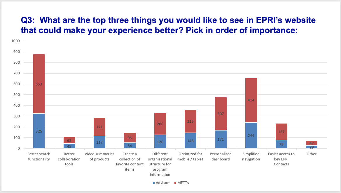
I began by conducting stakeholder interviews with different user groups ranging from utility engineers looking for technical specifications to policy makers seeking high-level insights. This research revealed that users weren't just looking for information; they were looking for actionable intelligence that could inform critical energy decisions.
Key insight: Different user personas needed the same content presented at different levels of detail and technical complexity.
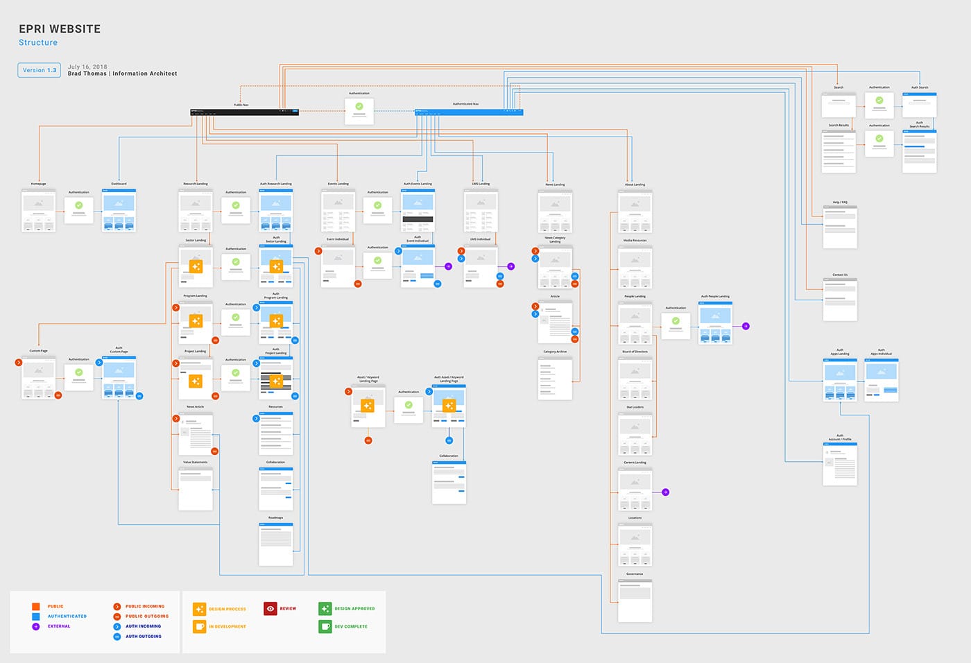
Information Architecture Reimagined
Working closely with EPRI's research teams, I mapped out how users actually think about energy challenges versus how the organization was structured internally. This led to a content strategy that prioritized user mental models over internal departmental structures.
I created user journey maps that showed how a utility executive might move from seeking broad industry trends to diving deep into specific technical reports - and designed pathways that supported this natural progression.
Visual Design and Brand Expression
The visual redesign needed to balance EPRI's scientific credibility with a more approachable, forward-thinking aesthetic. I developed a design system that:
- Used clean, contemporary typography that remained highly readable across technical documents
- Implemented a color palette that conveyed both trustworthiness and innovation
- Created modular components that could adapt to different content types and user needs
- Established clear visual hierarchies for complex technical information
Prototyping and Iteration
Throughout the process, I created interactive prototypes that allowed stakeholders to experience the new user flows firsthand. This was crucial for a scientific organization where evidence-based decision making is paramount.
Testing approach: I conducted usability sessions with real EPRI members, observing how they navigated to specific research areas and consumed different types of content.
Key Design Decisions
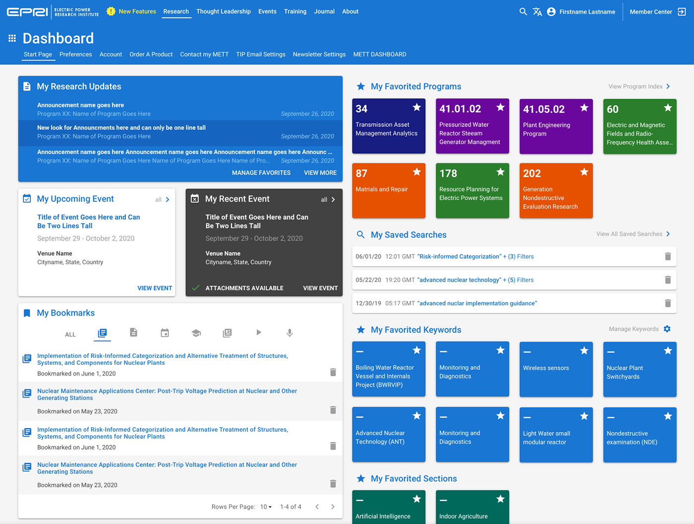
Personalized Content Pathways
Instead of forcing all users through the same navigation, I designed adaptive entry points that recognized different user types and surfaced relevant content immediately.
Simplified Technical Communication
I worked with EPRI's research teams to develop content templates that could present complex energy research in multiple formats - from executive summaries to detailed technical specifications.
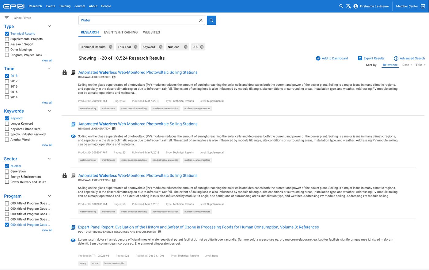
Enhanced Search and Discovery
Recognizing that much of EPRI's value lies in its extensive research library, I prioritized intelligent search functionality that could understand both technical terminology and business contexts.
Lessons Learned
1. Scientific Organizations Need Design Thinking
Working with researchers taught me that good design isn't just about aesthetics, it's also about creating systems that help people make better decisions with complex information.
2. Stakeholder Alignment is Everything
With multiple internal departments and diverse external users, success depended on finding design solutions that served everyone without compromising anyone's core needs.
3. Content Strategy Drives Experience Design
The most beautiful interface fails if users can't find the information they need. Content strategy had to come first, with visual design supporting those information needs.
4. Accessibility Extends Beyond Compliance
True accessibility meant designing for users with different levels of technical expertise, not just different abilities.
The Outcome
The redesigned EPRI experience delivered measurable improvements:
- Increased user engagement with key research content
- Improved navigation success rates across different user types
- Enhanced brand perception as a forward-thinking research leader
- Streamlined content management for EPRI's internal teams
More importantly, the project demonstrated how thoughtful design can amplify the impact of critical energy research by making it more accessible to decision-makers who need it.
Skills Demonstrated
This project showcased several key aspects of my design approach:
Strategic Thinking: Balancing multiple stakeholder needs while maintaining focus on core user objectives
Systems Design: Creating scalable design patterns that could evolve with EPRI's research priorities
Content Strategy: Developing frameworks for presenting complex technical information across different audience needs
Collaborative Process: Working effectively with scientific researchers and technical teams who think differently about user experience
Iterative Design: Using prototyping and user feedback to refine solutions throughout the development process
Looking Forward
The EPRI project reinforced my belief that great design happens at the intersection of user needs, business objectives, and technical possibilities. In the energy sector, where the stakes for good decision-making are incredibly high, design has a crucial role to play in making critical information accessible and actionable.
Working with EPRI's team of world-class researchers reminded me that the most impactful design work often happens behind the scenes - creating systems and frameworks that enable brilliant people to do their best work and share it with the world.
This project exemplifies my approach to complex B2B design challenges: start with user needs, respect organizational expertise, and create solutions that serve both immediate usability and long-term strategic goals.


Comments ()